DIVI SHORTCODE – ADDING & CUSTOMIZING THE TOOLTIP
By Divi Dude
Here’s a tip: Use the shortcode Tooltip. See what I did there? I don’t use a lot of the shortcodes that come with Divi, or the ones that come in the Elegant Themes shortcode plugin package for that matter. But one of the ones I do use is Tooltip (along with Dropcap).
It’s pretty basic, it just adds some additional information when you hover over a word or phrase.
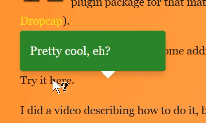
Try it herePretty cool, eh?.
I did a video describing how to do it, because I like doing videos. Watch the really short video, and then scroll down to find out how to customize the Divi Tooltip. And towards the bottom of the page is the YouTube tutorial, if you’d rather watch than read (plus it explains it much more).
Customizing Divi Tooltip
Now, that you know how to apply Divi’s Tooltip, let me show you some simple techniques you can use to customize it.
In the section, I will show you how to:
- Add a help cursor
- Change the colors and size
- Change the arrow
- Add an icon to Tooltip
Change the Cursor to Help Cursor
When you use the Tooltip Shortcode out of the box, you’ll notice the cursor does not change. I want my readers to know that there is a helpful tip there, so I’m going to change the cursor to the help symbol.

.et-tooltip {
     Cursor: help;
}
Change the Styles of Background and Font
If your website is on a white background, then the current Tooltip CSS might not aesthetically work for you, because it is black text on a white background. Let’s change it to something a little better. Underneath the .et-tooltip we used above, we will enter this code to start:
.et-tooltip-box {

}
I always find it helpful to grab the existing CSS, so I know what I have to change, hide and add. The CSS for the Tooltip Shortcode looks like this:
What the standard CSS Code looks like that we'll be changing.
.et-tooltip-box {
    display: none;
    position: absolute;
    bottom: 35px;
    left: -94px;
    width: 235px;
    padding: 20px 25px 22px 25px;
    border: 1px solid #dbdbdb;
    -webkit-border-radius: 10px;
    -moz-border-radius: 10px;
    border-radius: 10px;
    color: #6d6e6e;
    background: #fff;
    -webkit-box-shadow: 1px 1px 5px 1px rgba(0,0,0,.1);
    -moz-box-shadow: 1px 1px 5px 1px rgba(0,0,0,.1);
    box-shadow: 1px 1px 5px 1px rgba(0,0,0,.1);
    line-height: 18px;
}
Now that we know what we’re working with, we’re going to customize many of the settings. We will change font color, font size, background color, border-radius, box-shadow (aka drop-shadow), and left margin.
Since we are making no changes to display or position, we will ignore these. Remember, when adding custom CSS to a child theme or to the custom CSS panels in Divi, the additions you make to CSS will add to the class, or rewrite a rule if it’s part of the class included in Divi. If you do not make any changes to a variable, you needn’t reenter it as it will be untouched, thus remaining the same. That’s a lot of words to say: if you ain’t changing it, don’t worry about it.
Now let’s make our background green, while making our font white and giving it a custom size. So here’s what we’re going to enter:
Changing font and background colors. Adding new font size.
.et-tooltip-box {
	color: #fff !important;
	background: #32952d !important;
	font-size: 1.2rem;
}
I want to change the line-height, so that it is 1.8 times whatever font-size I use. And then I want to change the color of the border. We could remove it, but I prefer to leave it so that it doesn’t mess with my arrow later on. You can experiment with having a border or not (to remove, you’d add the CSS border: none;). You’ll want it to be the same color as your background. In my example, it’s a green with a hex value of: #32952d. And finally, I want to change the border-radius (the rounder corners of the box) so they are a little less rounded. So here’s the code we will use (notice we are adding to what we already did):
Changing line-height, border and border-radius.
.et-tooltip-box {
	color: #fff !important;
	background: #32952d !important;
	font-size: 1.2rem;
	line-height: 1.8;
	border: #32952d solid 1px;
	border-radius: 5px;
	-webkit-border-radius: 5px;
	-moz-border-radius: 5px;
}
MAKE YOUR DIVI LIFE EASIER
Divi Booster is a Divi plugin that just makes your life as a website developer easier. It adds about 50 functions to the already impressive Divi WordPress theme. Want an example? Here’s a video I did showing the long way and the short way to add additional social media pages to your Divi theme (guess which plugin I used to show the short way). But it doesn’t just help with social media, it also allows you to make adjustments to sliders, headers, posts, pages, modules … like I wrote above, it does about 50 things (I write “about” because it is continuously updated with more functions). $29.
I don’t like the way the Tooltip starts at the left of the area in which it is displaying a tip for. So I want to move the margin so it lines up on the left. To do this, we will change the left margin. I also want to add a much more distinguished box-shadow to the Tooltip box. For information on adding drop-shadows, see the tutorial I created on YouTube. And lastly, I want to make the padding more uniform, so I’m going to make it the same. Again, we will add on to the code we already have.
Changing left margin, drop-shadow and padding.
.et-tooltip-box {
	color: #fff !important;
	background: #32952d !important;
	font-size: 1.2rem;
	line-height: 1.8;
	border: #32952d solid 1px;
	border-radius: 5px;
	-webkit-border-radius: 5px;
	-moz-border-radius: 5px;
	left: 0;
	box-shadow: 0 8px 16px rgba(14,27,35,.15);
	-moz-shadow: 0 8px 16px rgba(14,27,35,.15);
	-webkit-shadow: 0 8px 16px rgba(14,27,35,.15);
	padding: 15px;
}
Now let’s set where the bottom ends up. We’re going to use the calculation command in CSS. What we can do with this is cause the Tooltip to have a little movement to it. I use 25px in my CSS code, but play with that number by making it 200px to see what it does.
Changing the bottom and adding a calculation. The final Toolbox code.
.et-tooltip-box {
	color: #fff !important;
	background: #32952d !important;
	font-size: 1.2rem;
	line-height: 1.8;
	border: #32952d solid 1px;
	border-radius: 5px;
	-webkit-border-radius: 5px;
	-moz-border-radius: 5px;
	left: 0;
	box-shadow: 0 8px 16px rgba(14,27,35,.15);
	-moz-shadow: 0 8px 16px rgba(14,27,35,.15);
	-webkit-shadow: 0 8px 16px rgba(14,27,35,.15);
	padding: 15px;
	bottom: calc(100% + 25px);
}
Changing the Tooltip Down-Arrow
So if you follow along above, you will notice the down-arrow does not match and it’s in the wrong location. We can fix that by changing the CSS Code for the down-arrow. Let’s get started by adding the following CSS Code just below the .et-tooltip-box code we just customized:
.et-toolbox-arrow {

}
Here’s the code that comes standard with Divi that we need to change:
The original code we are customizing.
.et-tooltip-arrow {
    display: block;
    position: absolute;
    bottom: -13px;
    left: 129px;
    width: 24px;
    height: 13px;
    background: url(//dividude.com/wp-content/themes/Divi/epanel/shortcodes/images/shortcodes-sprite.png) no-repeat -120px -2px;
}
If you want to get rid of the down-arrow all together, then you need to add this code.
Only use to remove arrow.
.et-toolbox-arrow {
	display: none;
}
If you like the down-arrow, you need to match it to the background color we just created. We don’t worry about the display and position, so we’ll ignore those. We’ll change the other attributes and get rid of the background graphic that currently is the down-arrow.
Changing the attributes of the arrow and removing graphic.
.et-tooltip-arrow {
	bottom: -12px;
	left: 25px;
	width: 20px;
	height: 13px;
	background: none;
}
Here we are going to re-add the down-arrow now, but instead of using a graphic like what was used previously, we will do it with borders. We want to use the same green color as previously used for the background: #32952d. And we don’t want the borders showing up on the sides, so instead of giving those a color, we make them transparent. Notice how we now have a down-arrow by just using a little CSS.
Creating the down-arrow with borders.
.et-tooltip-arrow {
	bottom: -12px;
	left: 25px;
	width: 20px;
	height: 13px;
	background: none;
	border-top: 13px solid #32952d;
	border-left: 10px solid transparent;
	border-right: 10px solid transparent;
}
Adding An Icon After The Tooltip Tip
There are two ways to go about this. One, is to include the icon with the text, so if you hover over it the sentence or the icon it will reveal the tip. Here is an example of this method:
Hover your cursor over me here.See how the Tip Box showed up no matter where you placed your cursor.The second method is to just have the icon reveal the tip. In this case, the tip box will only show up if someone hovers over the icon only. Here is an example of this method:
Hover over me and nothing happens.Notice nothing happened when you hovered over the sentence, but this Tip Box popped up over the icon
We need to add the icon to the Tooltip CSS. Since we want to appear after the tip (in the first example above), we must tell our CSS to put it after the tip. We do that by using :after. And since we want it to appear after the Tooltip, we customize that part of the CSS code, so we’ll add it to the .et-tooltip like this:
The first step is to add this custom CSS.
.et-tooltip:after {

	}
On this page you will notice that I use the I'm all by my lonesome symbol. I get this from the icons that come standard in Divi. You can find those by following this link.
Scroll down towards the bottom of the page and you will find the question mark symbol has a hex value of: 
When using the hex values (or unicode), you will ignore all the symbols, and just use the letter and number for the CSS (if you are using icons from a different font family, then be sure to follow their instructions on how to enter them in your CSS.) So in our case, we use: e064.
Be sure to customize the icon to fit your needs. On my site I use a grey color, add a little bit of padding to ensure that it doesn’t abut the previous word, and make it a little bit smaller than the text. It’s also important to make sure you tell Divi which font the icon is from. So here’s the code I end up with:
How my Tooltip icon is styled.
.et-tooltip:after {
	content: "e064";
	font-family: 'ETmodules';
	color: #777;
	padding-left: 5px;
	font-size: 80%;
	}
This will automatically put the icon after the tip. If you want it as part of the sentence, then you simply have to do this:
Adding the Shortcode for Divi Tooltip
[tooltip text="Put your custom tooltip info here"]Here is the sentence I want to have a tooltip on[/tooltip].And if you just want to have the icon appear after the sentence, then you enter it this way:
Adding Divi Tooltip Shortcode with Just an Icon.
Here is the sentence I want to have a tooltip after[tooltip text="Put your custom tooltip info here"][/tooltip].Customize Divi Tooltip Wrap-Up
Everything above is how I customize the Tooltip for all my sites. Every site has different colors and sizes and such. As should yours. But by knowing the proper CSS Classes for the Tooltip, and a bit of CSS know-how, you can stylize your Divi Tooltip so it fits your site.
Here is the code I ended up using on this site at the time I wrote this article. It may have changed some by the time you are reading it: It has changed a bit since writing this:
The Custom CSS for Divi Tooltip I Used.
/* Tooltip */
.et-tooltip {
	cursor:help;
}
.et-tooltip:after {
	content: "e064";
	font-family: 'ETmodules';
	color: #777;
	padding-left: 5px;
	font-size: 80%;
	}
.et-tooltip-box {
	 background: #32952d !important;
	color: #fff !important;
	border: #32952d solid 1px;
	border-radius: 5px;
	-webkit-border-radius: 5px;
	-moz-border-radius: 5px;
	line-height: 1.8;
	left: 0;
	bottom: calc(100% + 25px);
	font-size: 1.2rem;
	padding: 15px;
	box-shadow: 2px 2px 10px 2px rgba(0,0,0,.5);
	-moz-box-shadow: 2px 2px 10px 2px rgba(0,0,0,.5);
	-webkit-box-shadow: 2px 2px 10px 2px rgba(0,0,0,.5);
}
.et-tooltip-arrow {
	display: block;
	bottom: -12px;
	left: 25px;
	width: 20px;
	height: 13px;
	background: none;
	border-top: 13px solid #32952d;
	border-left: 10px solid transparent;
	border-right: 10px solid transparent;
}
How to Customize Divi’s Tooltip Video
If all this reading was a bit much for you, I have created a video that shows you how to customize the Divi Tooltip visually.
Must Have Plugins


Faster WordPress Hosting

Affordable Domain Registration
Get $1.00 off.
DiviDudeWeb16

Favorite WordPress Theme

Start Your Newsletter

For Your Inner Nerd

Affiliate marketer: Which means when you click a link and purchase an item, I may receive a commission.
More From Divi Dude

Delete Spam Comments in Bulk Without Plugin on Cloudways
Sometimes you screw up and forget to turn off comments on your WordPress website, or forget to configure your Askimet, or do both, and then you end up with thousands of comments that are nothing but spam. We’re talking hundreds of pages worth of comments that need to…

MailerLite is an affordable, easy-to-use newsletter and email marketing platform
For the longest time I used MailChimp. I was drawn to the 2,000 free subscribers.
But when MailChimp changed how they defined subscribers and made some other not so user friendly changes, I started looking for alternatives. Not just for the free tier, but for my paid subscriber lists (I have clients that send out newsletters and they need more bang for the buck than what many free tier offers).
Delete Spam Comments in Bulk Without Plugin on Cloudways
Sometimes you screw up and forget to turn off comments on your WordPress website, or forget to configure your Askimet, or do both, and then you end up with thousands of comments that are nothing but spam. We’re talking hundreds of pages worth of comments that need to…

Hi!
I came across your tutorial but am not able to find the Elegant themes shortcode pack. Is it no longer available?
Thanks!
There is no shortcode pack that I’m aware of. The Tooltip and Dropcap shortcodes are built into Divi. It works as of 3.29, hopefully will continue when they release Divi 4 in mid-October.
Hi!
Thank you for this post!
If I want the tooltip box to be shown below the text. How should I do that?
Thanks!